Payments Council - Rousing Reports!
CASE STUDY - working with the designer 4.3.2014
Clear gloss foil, with a nice bit of indentation - 2 finishes for the price of one almost!
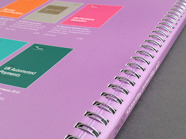
Each year there are a series of 7 documents and each year a new cover treatment is required. We have used punchy pantones, registered and blind spot UV Varnish, Laser-cutting and last year, clear foiling and the introduction of uncoated material. Whatever style is required, it will be consistent throughout the series. A different colour scheme is used for each 'product' but they all look very much part of a family once complete.
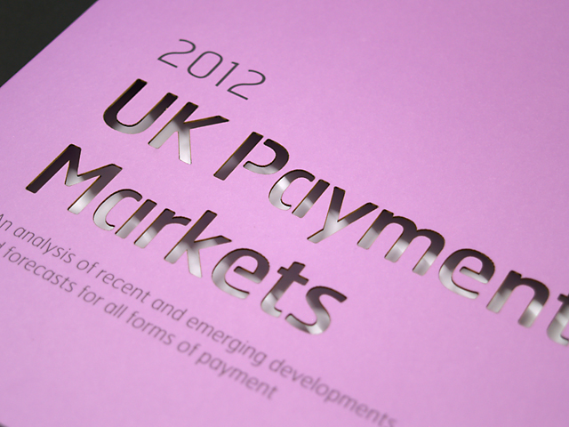
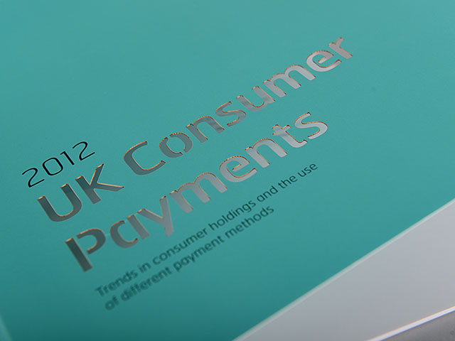
Too intricate to die-cut, the titles on all 2012 publications were laser cut. One of the issues essential in this working was that we had to drastically limit the burning/scorching that is associated with laser cutting. With certain 'special attention', we had this nailed - no scorching at all!
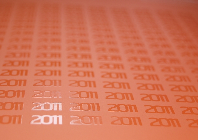
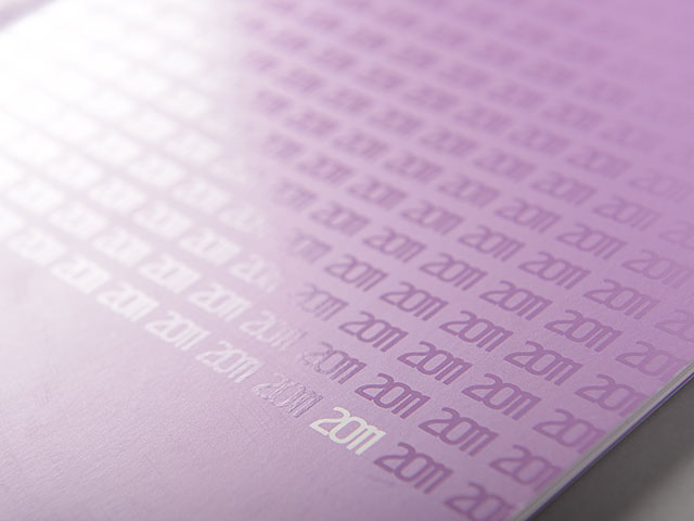
2011 - matt lam with stunning HIGH BUILD spot gloss UV varnish. Want to know how to set up artwork for spot UV? Please check here.
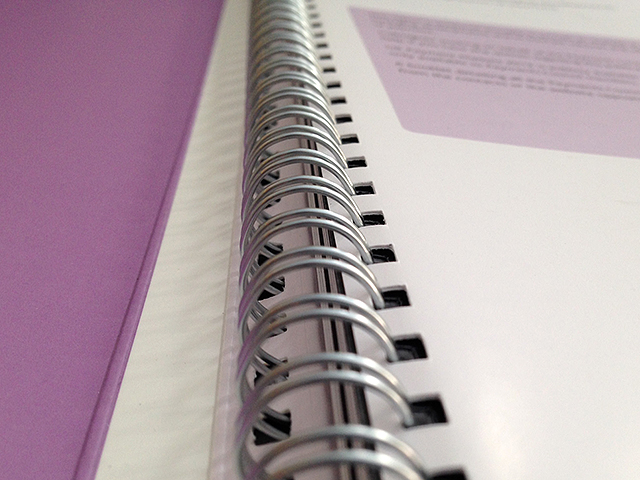
Each report, depending on the page extent, is bound in one of three ways: Half Canadian Wiro, PUR or Saddle-stitched. Despite the different binding methods, the brand consistency means that they always work well as a family!
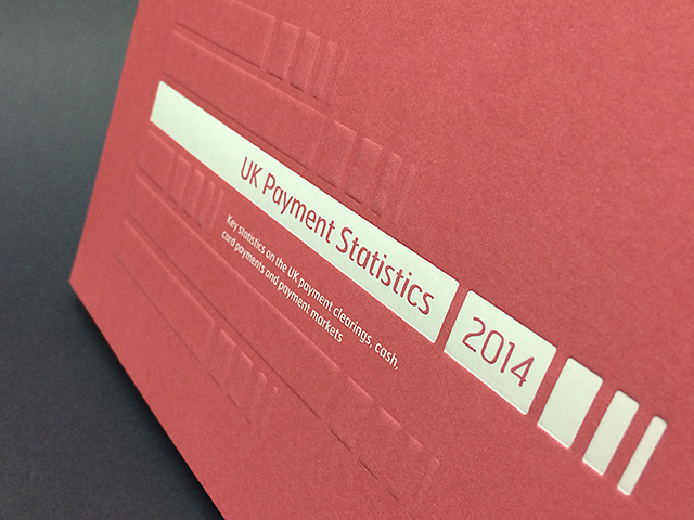
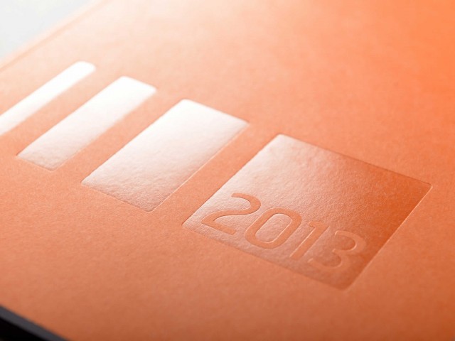
For 2014 the covers were produced with a blind emboss and white gloss foil. Test proofs were done and they looked stunning . . . onwards! For each report the emboss is common, only the white foil artwork changes each time.
A few months before the projects kick off, we'll get together to discuss the options. We'll explore the various concepts and work out the best way to implement. We will obviously look at costings and will usually run a few tests just to ensure everything will work well across all the reports.
As a consultative printer (all printers are NOT the same by the way), we really want to achieve the best results possible. Sometimes there are limitations and challenges to overcome but with our experience and commitment, we'll always do our utmost to deliver . . . Orbital totally understand and trust us in this process and I am very sure this is why we have worked together for so long.
Many thanks to Justin, Jen, Becki and everyone at Orbital for your trust, loyalty and friendship (and for some of these pics)! Long may it continue . . .
As a print designer, you will automatically consider things like photography, type, layouts and colour as part of your project. Without doubt all of these are vital but I really think that paper, print and finish can often be equally as important - they too should form part of your creative thinking!
If you have a project that may seem a little tricky and you want professional and honest input and advice, please do contact me - I would be very happy to help. I know paper, repro, print and finishing inside-out, in short, I know my stuff and I only want to help you produce the best possible result. Of course, I would be only too pleased to meet with you to discuss . . . I will always come armed with samples, mock ups and swatches, along with a creative, open mind.
Until next time . . . thanks for reading.